US Soccer.com redesign
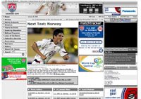 So I go to look at US Soccer this morning and to my surprise I see they have redesigned their site. All and all, I like the new look. It is nothing really innovated or new to the world of the web, but I think it looks a lot more interesting and up-to-date then the old site. Still, it seems a little wide to me. It appears to have four different columns, which seems a little busy to my eye.
However, I think this design will work well with the increase in traffic I'm sure it will get as June comes closer and closer.
By the way, I like the countdown clock to the nest US match at the top of the site. Also, I like that video is present on the front page, but again, it being in the fourth column seems a bit much. Also, it would be great if you could download the video for play on say a video iPod.
posted by Mike H at 5:34 PM
![]()


0 Comments:
Post a Comment
<< Home